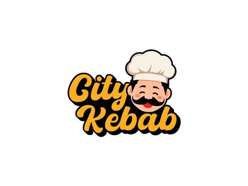
is a visually appealing representation of a restaurant offering a fusion of Turkish and American cuisine, reflecting the diversity of its menu. The client requested the inclusion of a chef illustration, emphasizing professionalism and quality in food preparation. The design combines playfulness and professionalism, using a bold and elegant yellow font with a black shadow that adds depth and improves readability. This type of logo is known as a Combination Logo, as it integrates both a visual element (the chef) and a text element (“City Kebab”), making it unique and memorable. The chosen colors evoke warmth and hospitality, with yellow symbolizing appetite and energy, while the black shadow provides excellent contrast, enhancing brand recognition. Additionally, the logo design is highly engaging due to the chef’s friendly expression, which creates a welcoming impression for customers. The large white chef’s hat represents the traditional culinary expertise of high-quality restaurants, while the smiling face conveys a sense of comfort and an enjoyable dining experience. These thoughtful details make the logo more relatable to customers, helping to establish a strong emotional connection with the brand. Moreover, the choice of typography with a smooth and stylish flow adds a friendly and easily recognizable touch. The black shadow behind the text ensures greater visibility, making it stand out across various backgrounds and advertising materials. This strategic approach enhances brand recognition across billboards, menus, and social media, creating a strong visual identity that stays in customers’ minds for a long time When it comes to food service, the experience goes beyond taste—it starts with the visual appeal of the menu. At City Kebab, the menu design reflects a professional approach that combines consistency and organization, making it both easy to navigate and visually appealing. Menu is intelligently divided into clear categories such as Pizza, Pasta, Schnitzel, Salads, and American Dishes. This structured layout directs the customer’s attention to their desired section, ensuring a smooth and quick browsing experience. Prices are neatly aligned with each dish, making decision-making effortless and efficient. The choice of colors is not random but based on visual psychology. The yellow and orange used in the headings convey warmth and energy while also stimulating appetite. The black accents provide elegance and contrast, making the text stand out clearly. This interplay of colors creates a perfect balance between vibrancy and professionalism, enhancing the overall appeal of the menu. Images play a crucial role in stimulating customers’ appetites and engaging their senses before they even taste the food. The food images are carefully selected, displaying fresh and appetizing dishes with high-quality visuals. However, the most unique element is the consistent visual theme achieved through the black-and-white checkered serving paper beneath the dishes, reinforcing the restaurant’s identity and professionalism. A key highlight of this menu is its balance between text and visuals. Instead of overcrowding the layout with excessive information, there is ample white space between different sections. This gives the eyes a rest while reading and makes navigating through the categories seamless. The white spaces contribute to a clean and structured design, ensuring a pleasant browsing experience for the customer. used in the menu reflect the restaurant’s identity—they are modern, stylish, and easy to read. The headings are bold and eye-catching, making each section stand out, while the body text remains clear and legible. The addition of black shadows to some headings enhances their visibility, making them more prominent and attractive. With its well-thought-out design, this menu is more than just a list of dishes and prices—it reflects City Kebab’s brand identity and commitment to delivering a seamless dining experience. The combination of colors, fonts, images, and white spaces creates a positive first impression, ensuring that customers feel comfortable and confident in their choices. A well-designed menu is not just a detail; it is a powerful marketing tool that enhances the customer experience and boosts sales—something this restaurant has successfully achieved.The “City Kebab” Logo
 Before
 After
After
 Before
 After
After
Menu Design: A Visually Integrated Experience That Attracts Customers
Structured Layout for Easy Navigation
Colors That Stimulate Appetite and Comfort
Images: A Visual Element That Enhances Customer Experience
Spacing and White Areas: A Touch of Elegance and Simplicity
Dynamic and Readable Fonts
Final Experience: A Menu That Reflects the Restaurant’s Identity
Are you ready to get started?
This website uses cookies to improve your web experience.


